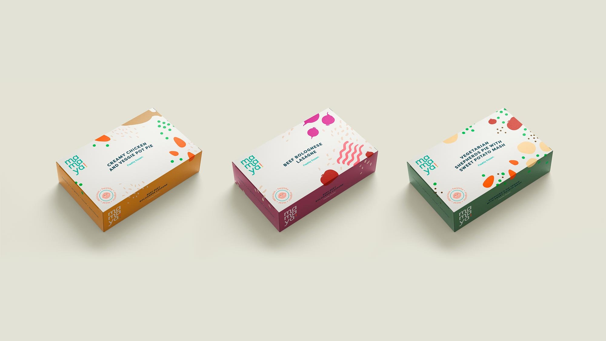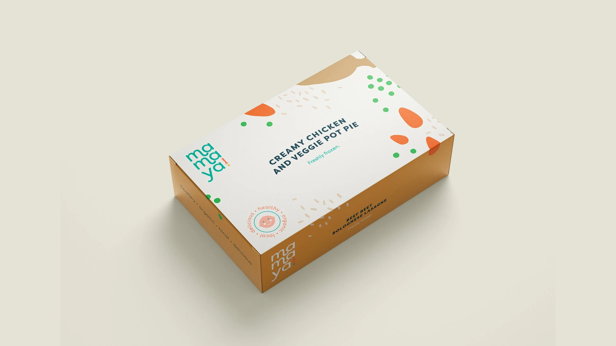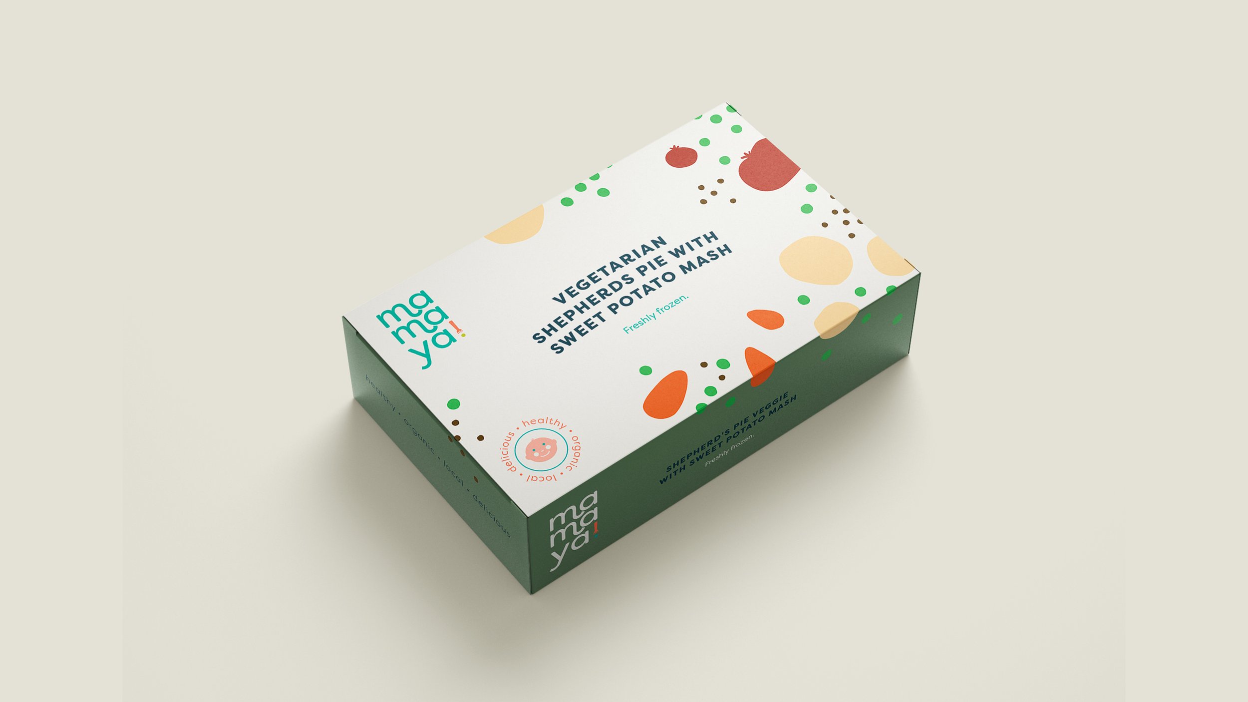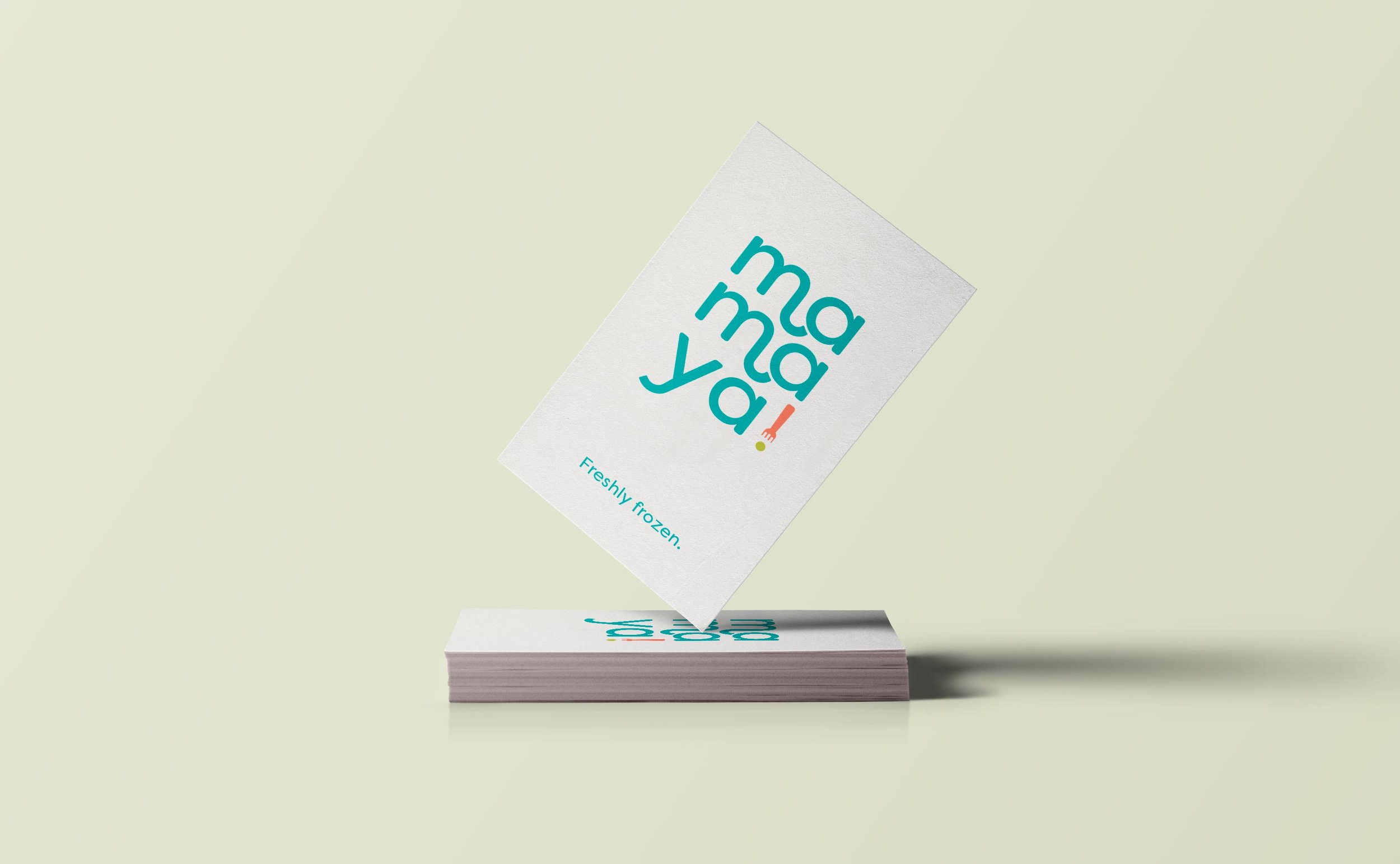
Mamaya!, is a swiss concept of frozen organic meals for kids. The branding should be appealing to moms looking for trendy and unique products for their children while sending the following key words: healthy, kids food, organic, local, delicious.
I created a logo in a modern sophisticated type with a creative twist in the shape of curvy parts. The round font reminds the softness of childhood. The exclamation dot is made of a fork and a little pea and can be used as icon and pattern. The packaging uses earthy colors and each meal is illustrated with the recipe’s ingredients.
Logo & packaging
Mamaya!

